


Big night ahead? Make your outfit do double duty: spark conversation and look great in photos. Adult Birthday Shirts channel retro cues—from neon pops to vintage badges—so your crew reads clean under LED and flash. In this guide, you’ll map fonts, colors, and placements to real venues, personalize without clutter, and pick fabrics that feel good past midnight. Expect practical rules, not fluff, plus ready-to-use ideas that Keep the Spark Alive with Birthday Shirts. Curated with creator-first know-how from LionKingShirt.
1. Photo-Ready Design at Night
Night lighting is unforgiving. Your letterforms, color contrast, and placement either sing or disappear. Think “readable at 2–3 meters” as the north star. Short slogans work; fussy scripts don’t. If you’re planning matching group shirts for a bar crawl or rooftop set, center-chest layouts and bold type keep everyone in sync for quick phone snaps.
Tees made to spark joy in every moment you celebrate
1.1 Contrast & Typeface for Night Shots
Go high-contrast: black or deep navy base with white letters and a single neon accent (electric blue or hot pink). Use a bold or condensed Grotesk for punchy lines like “Level 30 Unlocked” or “Still Got It.” Keep the headline under 24 characters, set line spacing around 110–120%, and maintain strokes ≥ 1.2 mm for legibility. For print files, design at 4500×5400 px, 300 DPI so edges stay crisp when you move from mockup to DTG or DTF.
1.2 Night Photography Tips (LED/Flash/Background)
Harsh LEDs blow out thin letters. Step a half pace off the brightest beam, face the ambient light, and keep the background simple—brick, matte walls, or a dark curtain. Lock the joke at center chest for vertical and horizontal frames. Test one quick shot before the party ramps up; if the neon ink flares, lower exposure or pick a non-fluorescent accent.
“Good retro reads fast: two beats to get the joke, one beat to smile.”
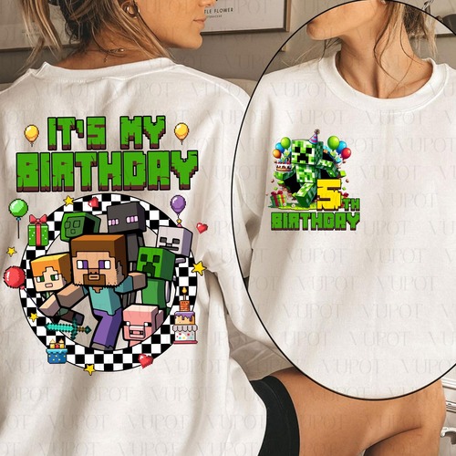
2. Personalization Without Clutter
Personalization wins when it feels effortless. Decide what you’re amplifying—either a punchline or a name-and-year lockup—then remove everything else. This keeps Adult Birthday T Shirts clean, coordinated, and camera-ready for your 21st/30th/40th/50th milestone.
2.1 Rule 1-1-1 (Name – Age – Year)
Choose one focal point. If it’s the slogan, move the year to a small badge at the left crest (about 2–3 cm from the arm seam). Work with one font family and one accent color so the hierarchy stays obvious. Example: “Chapter 40: Plot Twist” center chest + “1985” in a tiny sunburst badge.
2.2 Inside Jokes That Stay Photo-Safe
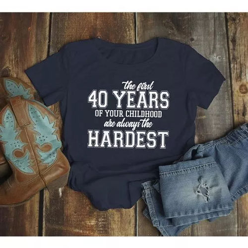
Boil a story to one short line: three beats, done. “Winner at Cake,” “Retro Since 1994,” “Queen of Quarters.” Avoid long setups or niche abbreviations. If your crew uses nicknames, slide them to the sleeve so the joke sits front and center. Quick test: if strangers can read it in under two seconds, it’s “photo-safe.”
3. Classic Retro, Defined
“Retro” skips the single snapshot; it's a spectrum of bygone vibes you tweak high or low. Seventies tilt toasty (mustard glows, scorched citrus) with flowing cursive or tiny elegant hooks; eighties crave electric flashes and pixel mazes via squat block letters; nineties veer toward misty bases, banded edges, plaid patterns, and spare insignias. For Birthday Shirts Ideas For Adults for Unforgettable Party Vibes, hitch an age hint to the spot:
- Bar/club: midnight canvas, electric trim, hefty squeezed tagline.
- Rooftop/dinner: foggy neutral or ivory, wee shield stamp, blocky or curved no-frills.
- House party: collared style, cursive cap, faint plaid or rayburst touch.
Tees made to glow with you from party to after-hours
Such blends yield lens-sharp graphics minus the holler. They sync with search whispers like “vintage birthday shirts,” “retro color combos,” and “font pairings for tees,” boosting your piece–and your getup–right on target.
4. Fits & Fabrics for Comfort
Stellar artwork flops if the shirt wrestles you through the evening. Hunt ringspun cotton for that sleek surface (inks pop clearer) and plush grip. Loose unisex cuts suit most packs; bump a size if layering denim armor or flight gear. Upkeep counts big: chill rinse (30–40°C), flipped, dodge the blaze to shield deep tones and halt that electric trim from washing out. Weighing DTG against screen versus DTF? Factor the scene:
- DTG: vivid rainbow layers, tiny runs, velvety lay–prime for tight crews.
- Screen print: unbeatable zing on sparse shades and glow juices–ideal for mobs.
- DTF: flexible on shadows or finicky cloths; tough for endless spins.
Bottom line, the goal's straightforward: fluid strides and steady hues through the shot reel.
5. Mini-FAQ
Short answers for long nights—and long-tail searches. Keep things practical and non-transactional.
Best fonts for group photos at night?
Bold/condensed sans (Grotesk or geometric) with tight kerning. Avoid thin scripts unless they’re oversized.
What color combos read from 2–3 meters?
Black/white + one neon accent; heather gray with black ink for daylight or indoor warm light.
DTG, Screen, or DTF for retro looks?
Screen wins for neon hits and high contrast. DTG excels at detailed gradients. DTF balances durability and color on dark bases.
How do I keep the set cohesive?
One idea, one font family, one accent color. That rule alone keeps Birthday T Shirts For Adults synced in every photo.
Quick Night-Ready Checklist
- Center-chest headline, ≤24 characters
- High contrast base + one neon accent
- File at 4500×5400 px, 300 DPI
- Stroke ≥1.2 mm; line spacing 110–120%
- One focal point (slogan or name-year badge)
Retro isn’t about cramming every era into one tee; it’s about picking a vibe and letting it breathe. Use these frameworks to shape Adult Birthday Shirts that turn heads, hold up in photos, and feel good until last call. Want more slogan starters and era-based color pairs to Keep the Spark Alive with Birthday Shirts For Adults? Save this guide and share it with your crew—then enjoy the compliments. Crafted with creator-grade standards from LionKingShirt.


Comments (0)